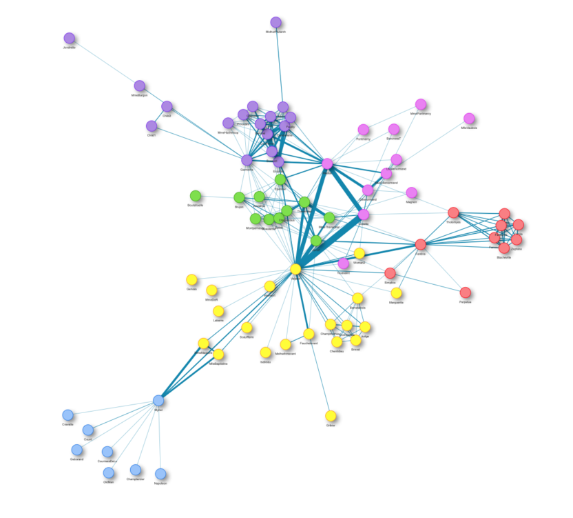
Die Codebase deines Data Science-Projekts wächst und wächst, und du drohst den Überblick zu verlieren? Dann kann dieses Tool vielleicht Abhilfe schaffen! Felix Plagge hat ein Paket geschrieben, das einen Call Graph für ein beliebiges Python-Skript erstellt. In diesem Artikel erklärt er zunächst, wozu Projektgrafiken nützlich sind und erklärt anschließend die Installation und Verwendung seines Pakets namens project_graph.
A Social Network Simulation In The Tidyverse
Do you want to visualize beautiful graphs in R but are shy to leave the tidyverse? Tidygraph and Ggraph ‚got you covered! See how their main functionalities are applied in this social network example!
Community Detection with Louvain and Infomap
The number of different products and customers in any business area are practically infinite.
But how can you find interactions between them like joint purchases and define groups? One solution is the so-called Community Detection. In this blog post, I want to show you the magic behind Community Detection and give you a theoretical introduction into the Louvain and Infomap algorithm.
Animated Plots using ggplot and gganimate
A short overview of the functionalities of the R package gganimate: Learn how to turn your static ggplots in beautiful animations showcasing your data.
rBokeh – Don’t be stopped by missing arguments!
rBokeh is an interactive plotting library. Since it functions lack some arguments compared to its Python counterpart, plots are sometimes difficult to customize. I will show how to overcome those issues and drill out the plot objects.
rBokeh – Tipps and Tricks with JavaScript and beyond!
rBokeh is an interactive plotting library. It has the capability to extend its features with customized JavaScript code. I show the most important aspects, guide through an example, and provide some useful tipps how to handle likely issues.
Data Science Bootcamp
Du interessiertst Dich für Data Science und möchtest Deine Daten sinnvoll nutzen? Im Data Science Bootcamp von der STATWORX Data Academy bekommen Einsteiger den perfekten Start in die Praxis. Gemeinsam erarbeiten wir in 5 Tagen die wichtigsten Grundlagen von Data Science, Machine Learning und Programmierung. Du entwickelst R und Python Modelle und arbeitest wie ein echter Data Scientist. Was …
Interactive Network Visualization with R
A walk through how networks are visualized at STATWORX using the package visNetwork.
6 myths about refuelling – tackled with statistics
Is it cheaper to fill up your gas tank in the evening? Many car drivers have their own theories and myths about refuelling. Our colleague Jakob tackled 6 of these myths using statistics in his latest blog post.
Fixing the most common problem with Plotly histograms
In today’s blog post, we show you how to improve the interactivity of Plotly histograms with automatically new rebinning.