Du wolltest schon immer wissen, wie man ein Frontend mit Python entwickelt? Im letzten Teil unserer vierteiligen Blogserie bauen wir ein interaktives Spiel, bei dem User*innen die Automarke- und Modell erraten muss. Seid ihr besser als unsere AI?
Du wolltest schon immer wissen, wie man ein Frontend mit Python entwickelt? Im letzten Teil unserer vierteiligen Blogserie bauen wir ein interaktives Spiel, bei dem User*innen die Automarke- und Modell erraten muss. Seid ihr besser als unsere AI?
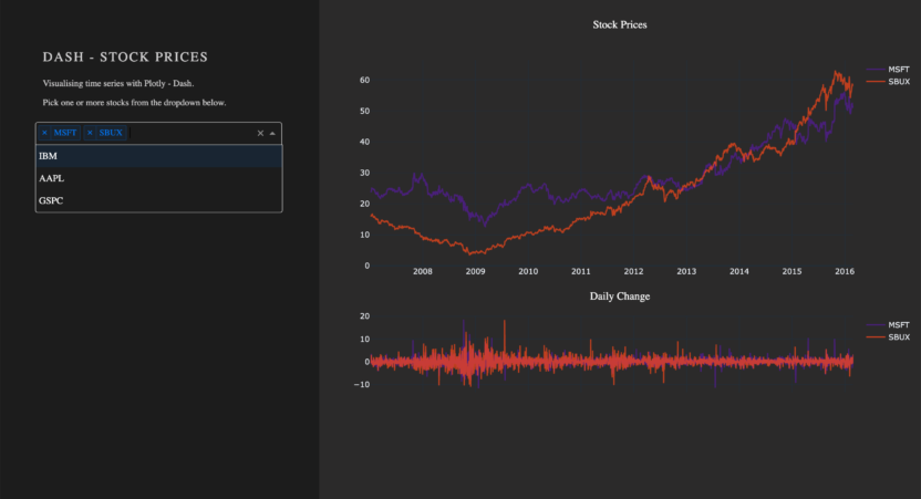
This blog is a hands-on experience in Dash, presenting core components, how to display figures with callbacks, supplying you with a working web application to play with, and the resources to build your own. Dash is a powerful tool for Python developers. Developed by the team behind Plotly, Dash is an open-source framework built on top of Flask, Plotly.js, and React.js.

Shiny enables its users to quickly create a fixed UI with code. Although simple, this can prove to be quite limiting. Applying the principles of reactivity to the UI part of a ShinyApp is a natural progression from reactive coding as we know it already from Shiny’s server side. This blog entry reviews and discusses two of the most convenient tools for doing so.
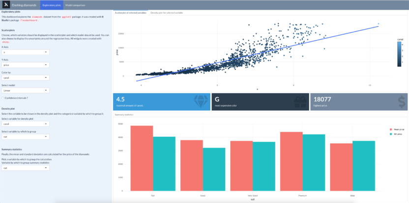
In this blog article, you will learn you how to set up a dashboard with the flexdashboard package, how to integrate interactive widgets and how to deploy the app on shinyapps.io.

Daten-Visualisierung und -Verständnis sind wichtige Faktoren bei der Durchführung eines Data Science Projekts. Eine visuelle Exploration der Daten unterstützt den Data Scientist beim Verständnis der Daten und liefert häufig wichtige Hinweise über Datenqualität und deren Besonderheiten. Bei STATWORX wenden wir im Bereich Datenvisualsierung eine Vielzahl von unterschiedlichen Tools und Technologien an, wie z.B. Tableau, Qlik, R Shiny oder D3. Seit …