A short overview of the functionalities of the R package gganimate: Learn how to turn your static ggplots in beautiful animations showcasing your data.

A short overview of the functionalities of the R package gganimate: Learn how to turn your static ggplots in beautiful animations showcasing your data.

Time flies by and we are more people now here at STATWROX. But, did we change our behavior in using emojis or are we still the same? I am revisiting my analysis and will have a look!

With the holidays approaching, one of the most discussed questions at STATWORX was whether we’ll have a white Christmas or not. And what better way to get our hopes up, than by taking a look at the DWD Climate Data Center’s historic data on the snow depth on the past ten Christmas Eves? But how to best visualize spatial data? …
Once upon a time, we at STATWORX used Slack just as a messenger, but than everything changed when emojis came… Since then, we use them for all kinds of purposes. For example we take polls with them to see were we will eat lunch or we capture unforgettable moments by creating new emojis. The possibilities are limitless! But since we …
The first time we at STATWORX are opening our doors for anyone who wants to learn more about data. Our “Data Visualization in R and ggplot2” workshop is designed for R-beginners and provides the perfect mixture between theory and practice. The workshop will be held in german at our office in Frankfurt. Participants achieve first insights into the concepts of …
In the last post of this series of the STATWORX Blog, we explored ggplot2's themes, which control the display of all non-data components of a plot. Ggplot comes with several inbuilt themes that can be easily applied to any plot. However, one can tweak these out-of-the-box styles using the theme() function. We did this last time. Furthermore, one also can …
As noted elsewhere, sometimes beauty matters. A plot that’s pleasing to the eye will be considered more gladly, and thus might be understood more thoroughly. Also, since we at STATWORX oftentimes need to subsume and communicate our results, we have come to appreciate how a nice plot can upgrade any presentation. So how make a plot look good? How make …
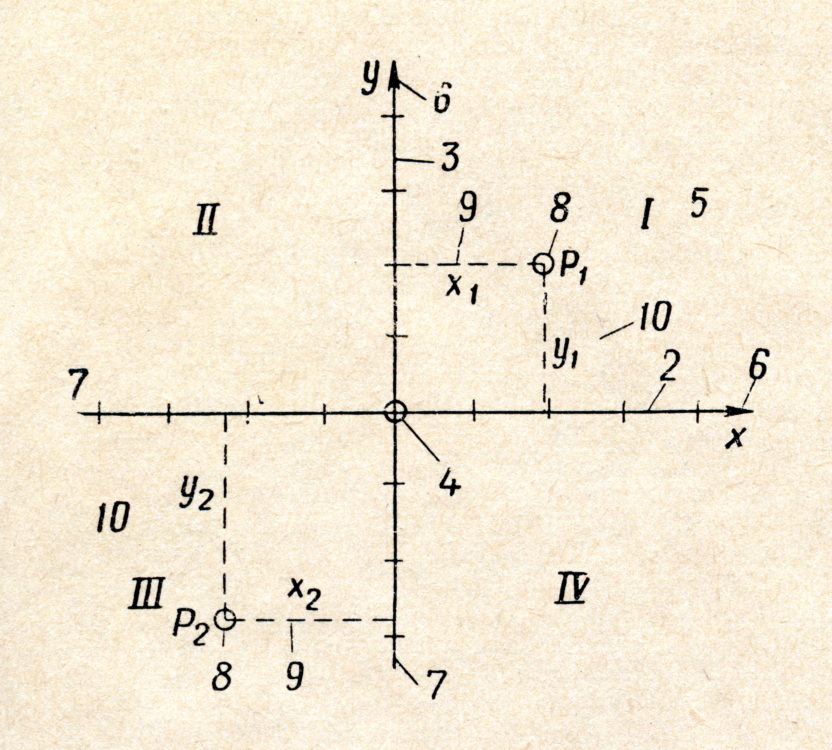
All plots have coordinate systems. Perhaps because they are such an integral element of plots, they are easily overlooked. However, in ggplot2, there are several very useful options to customize the coordinate systems of plots, which we will not overlook but explore in this blog post. Since it is spring, we will use a random subset of the famous iris …
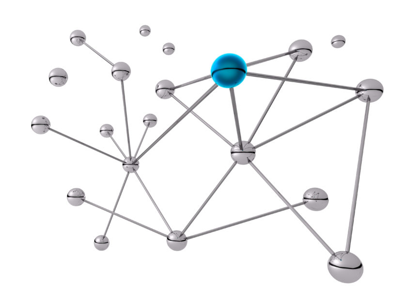
When you work on bigger R projects there comes a point when you may lose the overview of how your functions are connected. Or even worse: you get a large project and have to figure out what is actually happening! A possible remedy to this problem are flowcharts. If you started your project with a flowchart: good for you – …

.. oh what fun, it is to write, an R blog for this day! Der Grundgedanke von ggplot2 Das erklärte Ziel von Hadley Wickham’s package ggplot2, ist es R-Usern zu ermöglichen Daten einfach, ansprechend und vor allem informativ zu visualisieren. Dabei wurde angestrebt die Vorteile von sowohl base-R als auch dem älteren Package lattice zu übernehmen und deren Schwächen auszugleichen. …