BARC und STATWORX präsentieren vom 09. – 10. Oktober 2019 die Data University, in Fankfurt am Main. Die Data University ist ein interaktives Workshop- und Trainings-Event mit dem Fokus auf alle wichtigen Themen rund um Daten.

BARC und STATWORX präsentieren vom 09. – 10. Oktober 2019 die Data University, in Fankfurt am Main. Die Data University ist ein interaktives Workshop- und Trainings-Event mit dem Fokus auf alle wichtigen Themen rund um Daten.
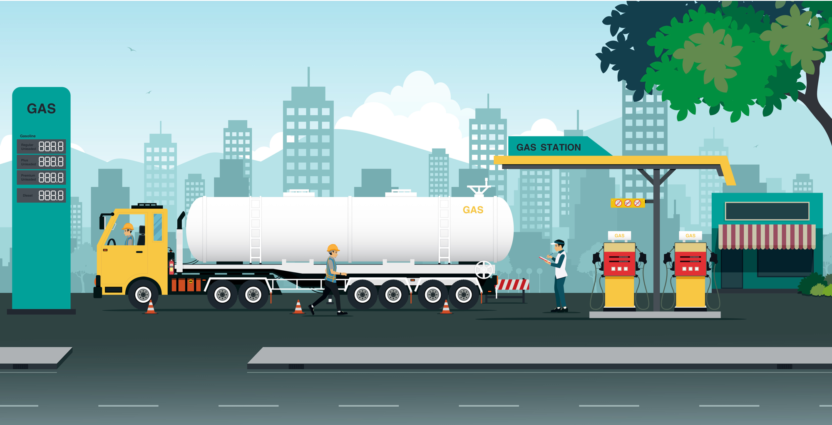
Is it cheaper to fill up your gas tank in the evening? Many car drivers have their own theories and myths about refuelling. Our colleague Jakob tackled 6 of these myths using statistics in his latest blog post.

It’s Valentine’s day, making this the most romantic time of the year. But actually, already 2018 was a year full of love here at STATWORX: many of my STATWORX colleagues got engaged. And so we began to wonder – some fearful, some hopeful – who will be next? Therefore, today we’re going to tackle this question in the only true way: with data science!
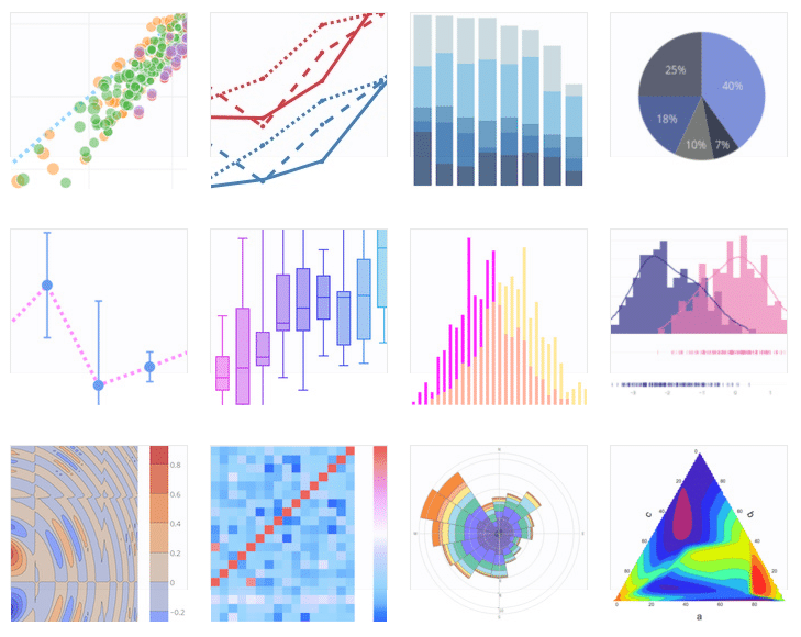
In this blog we will explore the plotly library for python and R. We show how plotly is structured and use the LA Metro Bike dataset as an example to create interactive plots.

With the holidays approaching, one of the most discussed questions at STATWORX was whether we’ll have a white Christmas or not. And what better way to get our hopes up, than by taking a look at the DWD Climate Data Center’s historic data on the snow depth on the past ten Christmas Eves? But how to best visualize spatial data? …
The first time we at STATWORX are opening our doors for anyone who wants to learn more about data. Our “Data Visualization in R and ggplot2” workshop is designed for R-beginners and provides the perfect mixture between theory and practice. The workshop will be held in german at our office in Frankfurt. Participants achieve first insights into the concepts of …

In the last post of this series of the STATWORX Blog, we explored ggplot2's themes, which control the display of all non-data components of a plot. Ggplot comes with several inbuilt themes that can be easily applied to any plot. However, one can tweak these out-of-the-box styles using the theme() function. We did this last time. Furthermore, one also can …

A while back, I started to create an R package that would help me and my collegues at STATWORX with our daily work. After writing the DESCRIPTION file, I did not want to do this ever again. I found the desc package which let's you parse, manipulate and reformat this file via some functions and ergo a script. If you …
Since a couple of months, I am working for STATWORX as a marketing manager (and I love it). My colleagues asked me many times, if it is possible to do a logo of R or Python, in different colors with transparent background, so the logo fits perfectly in their presentations. Here, I proudly present the result of my work (Download …

As many others too, me and some colleagues at STATWORX took part in a little betting game for the World Cup 2018. Since the group stage is over, I was wondering how well – or better – how worse my prediction was. I am comparing my result with other predictions by using the point system of the betting game. All …