
With the holidays approaching, one of the most discussed questions at STATWORX was whether we’ll have a white Christmas or not. And what better way to get our hopes up, than by taking a look at the DWD Climate Data Center’s historic data on the snow depth on the past ten Christmas Eves?
But how to best visualize spatial data? Other than most data types, spatial data usually calls for a very particular visualization, namely data points overlaying a map. In this way, areal data is automatically contextualized by the geographic information intuitively conveyed by a map.
The basic functionality of ggplot2 dosen’t offer the possibility to do so, but there is a package akin to ggplot2 that allows to do so: ggmap. ggmap was written by David Kahle and Hadley Wickham and combines the building blocks of ggplot2, the grammar of graphics as well as the static maps of Google Maps, OpenStreetMap, Stamen Maps or CloudMade Maps. And with all that, ggmap allows us to make really fancy visualizations:
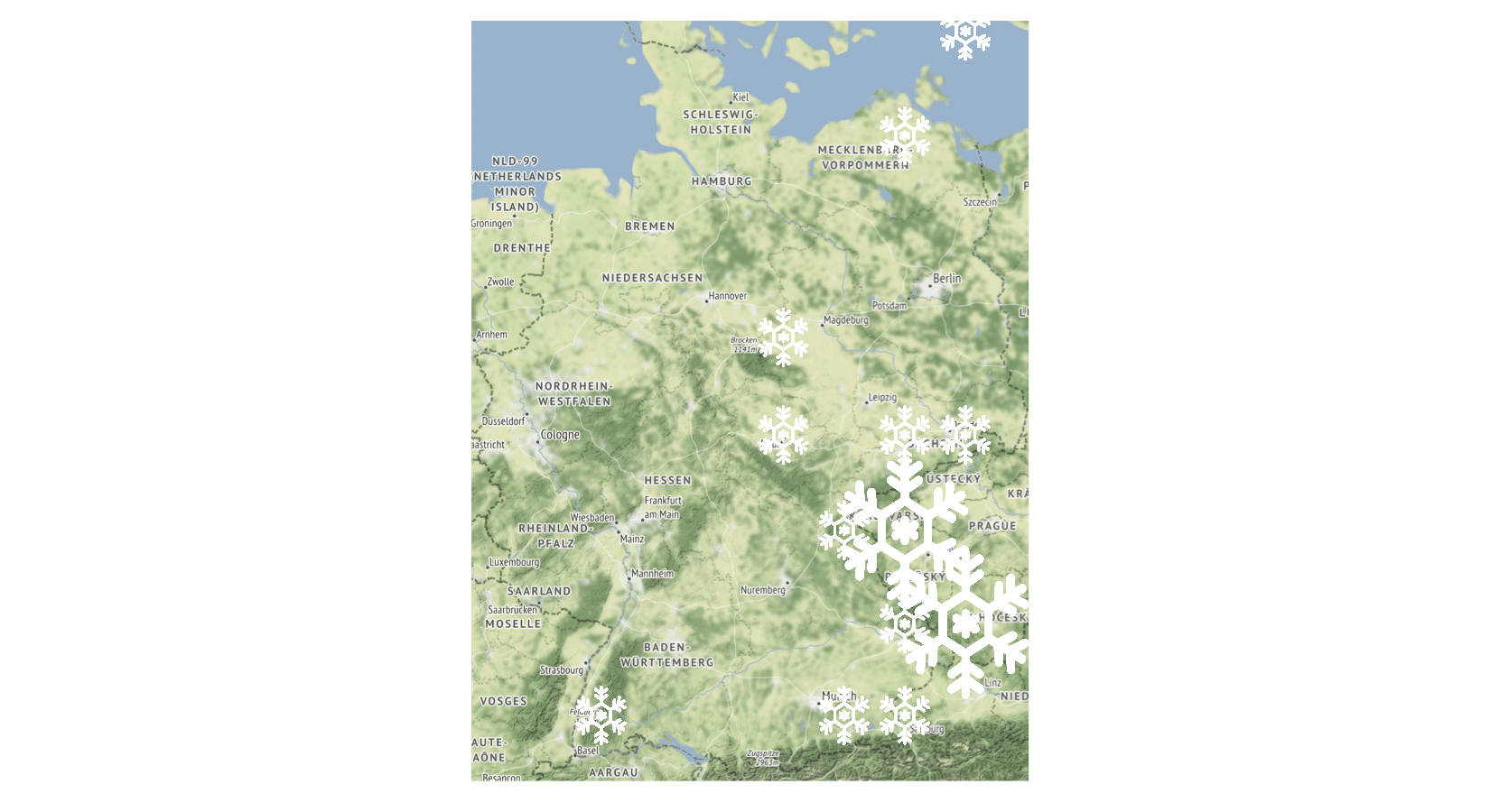
Above-average snow depth on Christmas Eve (2008-2017)
The original functionalities of ggmap used to be somewhat more general, broad and “barrier-free”, but since those good old days – aka 2013 – some of the map suppliers changed the terms of use as well as mechanics of their APIs. At the moment, the service of Stamen Maps seems to be the most stable, while also being easily accessible – e.g. without registering for an API that requires one to provide some payment information. Therefore, we’re going to focus on Stamen Maps.
First things first: the map
Conveniently, ggmap employs the same theoretical framework and general syntax as ggplot2. However, ggmap requires one additional step: Before we can start plotting, we have to download a map as backdrop for our visualization. This is done with get_stamenmap(), get_cloudmademap(), get_googlemap() or get_openstreetmap() or the more general get_map(). We’re going to use get_stamenmap().
To determine the depicted map cutout, the left, bottom, right and top coordinates of a bounding box, have to be supplied to the argument bbox.
Conveniently, there is no need to know the exact latitudes and longitudes of each and every bounding box of interest. The function geocode_OSM() from the package tmaptools, returns whenever possible the coordinates of a search query consisting of an address, zip code and/or name of a city or country.
library(scales)
library(tidyverse)
library(tmaptools)
library(ggimage)
library(ggmap)

<span class="hljs-comment"># get the bounding box </span>
geocode_OSM(<span class="hljs-string">"Germany"</span>)$bbox
     xmin      ymin      xmax      ymax
 5.866315 47.270111 15.041932 55.099161
The zoom level can be set via the zoom argument and can range between 0 (least detailed) and 18 (most detailed, quick disclaimer: this can take a very long time). The zoom level determines the resolution of the image as well as the amount of displayed annotations.
Depending on whether we want to highlight roads, political or administrative boundaries or bodies of water and land different styles of maps excel. The maptype argument allows to choose from different ready-made styles: "terrain", "terrain-background", "terrain-labels", "terrain-lines", "toner", "toner-2010", "toner-2011", "toner-background", "toner-hybrid", "toner-labels", "toner-lines", "toner-lite" or "watercolor".
Some further, very handy arguments of get_stamenmap() are crop, force and color:
As implied by the name, color defines whether a map should be in black-and-white ("bw") or when possible in color ("color").
Under the hood get_stamenmap() downloads map tiles, which are joined to the complete map. If the map tiles should be cropped so as to only depict the specified bounding box, the crop argument can be set to TRUE.
Unless the force argument is set to TRUE, even when arguments changing the style of a map have been altered, once a map of a given location has been downloaded it will not be downloaded again.
When we’ve obtained the map of the right location and style, we can store the “map image” in an object or simply pass it along to ggmap() to plot it. The labels, ticks etc. of axes can be controlled as usual.
<span class="hljs-comment"># getting map</span>
plot_map_z7 <- get_stamenmap(<span class="hljs-keyword">as</span>.numeric(geocode_OSM(<span class="hljs-string">"Germany"</span>)$bbox),
                          zoom = <span class="hljs-number">7</span>,
                          force = TRUE,
                          maptype = <span class="hljs-string">"terrain"</span>)

<span class="hljs-comment"># saving plotted map alone</span>
plot1 <- ggmap(plot_map_z7) +
  theme(axis.title = element_blank(),
        axis.ticks = element_blank(),
        axis.text = element_blank())

<span class="hljs-comment"># getting map</span>
plot_map_z5 <- get_stamenmap(<span class="hljs-keyword">as</span>.numeric(geocode_OSM(<span class="hljs-string">"Germany"</span>)$bbox),
                             zoom = <span class="hljs-number">5</span>,
                             force = TRUE,
                             maptype = <span class="hljs-string">"terrain"</span>)

<span class="hljs-comment"># saving plotted map alone</span>
plot2 <- ggmap(plot_map_z5) +
  theme(axis.title = element_blank(),
        axis.ticks = element_blank(),
        axis.text = element_blank())

<span class="hljs-comment"># plotting maps together</span>
plot <- gridExtra::grid.arrange(plot1, plot2, nrow = <span class="hljs-number">1</span>)
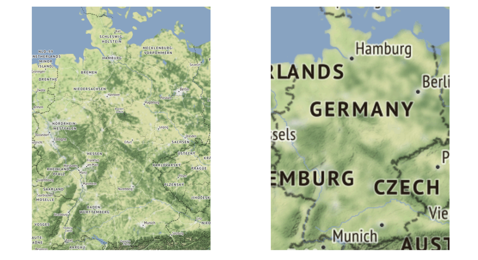
Example for maptype = «terrain» with zoom = 7 (left) vs. zoom = 5 (right).
Business as usual: layering geoms on top
We then can layer any ggplot2 geom we’d like on top of that map, with the only requirement being that the variables mapped to the axes are within the same numeric range as the latitudes and longitudes of the depicted map. We also can use many extension packages building on ggplot2. For example, we can use the very handy package ggimage by Guangchuang Yu to make our plots extra festive:
<span class="hljs-comment"># aggregating data per coordinate</span>
df_snow_agg <- df_snow %>%
  dplyr::mutate(LATITUDE = plyr::round_any(LATITUDE, accuracy = <span class="hljs-number">1</span>),
                LONGITUDE = plyr::round_any(LONGITUDE, accuracy = <span class="hljs-number">1</span>)) %>%
  dplyr::group_by(LATITUDE, LONGITUDE) %>%
  dplyr::summarise(WERT = mean(WERT, na.rm = TRUE))

<span class="hljs-comment"># cutting into equal intervals          </span>
df_snow_agg$snow <- <span class="hljs-keyword">as</span>.numeric(cut(df_snow_agg$WERT, <span class="hljs-number">12</span>))

<span class="hljs-comment"># setting below average snow depths to 0                   </span>
df_snow_agg <- df_snow_agg %>%
  mutate(snow = ifelse(WERT <= mean(df_snow_agg$WERT), <span class="hljs-number">0</span>, snow))

<span class="hljs-comment"># adding directory of image to use</span>
df_snow_agg$image <- <span class="hljs-string">"Snowflake_white.png"</span>

<span class="hljs-comment"># getting map</span>
plot_map <- get_stamenmap(<span class="hljs-keyword">as</span>.numeric(geocode_OSM(<span class="hljs-string">"Germany"</span>)$bbox),
                          zoom = <span class="hljs-number">7</span>,
                          force = TRUE,
                          maptype = <span class="hljs-string">"terrain"</span>)

<span class="hljs-comment"># plotting map + aggregated snow data with ggimage</span>
plot <- ggmap(plot_map) +
  geom_image(data = df_snow_agg,
             aes(x = LONGITUDE,
                 y = LATITUDE,
                 image = image,
                 size = I(snow/<span class="hljs-number">20</span>))) + <span class="hljs-comment"># rescaling to get valid size values</span>
  theme(axis.title = element_blank(),
        axis.ticks = element_blank(),
        axis.text = element_blank())
Above-average snow depth on Christmas Eve (2008-2017)
We can get creative, playing with all sorts of geoms and map styles. Especially visualization strategies to prevent overplotting can be quite handy:
For example, a facetted scatter plot with alpha blending:
<span class="hljs-comment"># getting map</span>
plot_map <- get_stamenmap(<span class="hljs-keyword">as</span>.numeric(geocode_OSM(<span class="hljs-string">"Germany"</span>)$bbox),
                          zoom = <span class="hljs-number">7</span>,
                          force = TRUE,
                          maptype = <span class="hljs-string">"watercolor"</span>)

<span class="hljs-comment"># facets per year, scatter plot with alpha blending </span>
plot <- ggmap(plot_map) +
  geom_point(data = df_snow,
             aes(x = LONGITUDE,
                 y = LATITUDE,
                 alpha = WERT,
                 size = WERT),
             color = <span class="hljs-string">"white"</span>) +
  facet_wrap(. ~ DATE, nrow = <span class="hljs-number">2</span>) +
  scale_alpha_continuous(range = c(<span class="hljs-number">0.0</span>, <span class="hljs-number">0.9</span>)) +
  theme(axis.title = element_blank(),
        axis.ticks = element_blank(),
        axis.text = element_blank(),
        legend.position = <span class="hljs-string">"none"</span>,
        strip.background = element_rect(fill = <span class="hljs-string">"white"</span>))
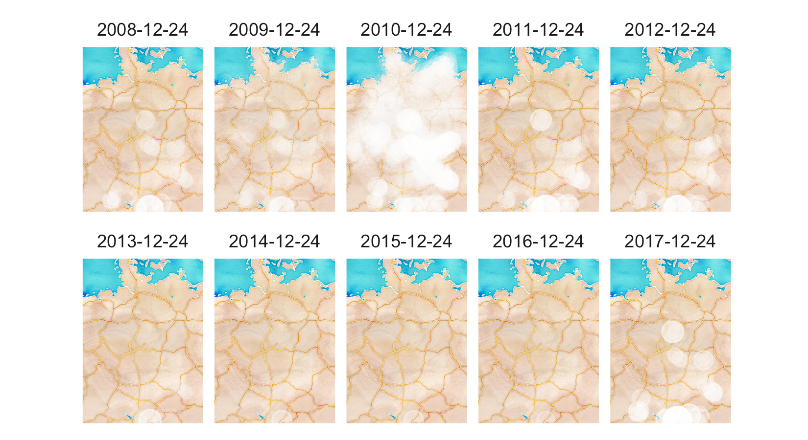
Snow depth on Christmas Eve per year (2008-2017)
Or density plots with either geom_line() or geom_polygon():
<span class="hljs-comment"># getting map</span>
plot_map <- get_stamenmap(<span class="hljs-keyword">as</span>.numeric(geocode_OSM(<span class="hljs-string">"Germany"</span>)$bbox),
                          zoom = <span class="hljs-number">7</span>,
                          crop = FALSE,
                          force = TRUE,
                          maptype = <span class="hljs-string">"toner-background"</span>)
<span class="hljs-comment"># density plot: lines</span>
plot1 <- ggmap(plot_map) +
  geom_density2d(data = df_snow_dens,
                 aes(x = LONGITUDE,
                     y = LATITUDE,
                     color = ..level..),
                 size = <span class="hljs-number">0.7</span>) +
  scale_color_continuous(low = <span class="hljs-string">"#17775A"</span>, high = <span class="hljs-string">"white"</span>,
                         name = <span class="hljs-string">""</span>,
                         breaks = c(<span class="hljs-number">0.01</span>, <span class="hljs-number">0.06</span>),
                         labels = c(<span class="hljs-string">"little snow"</span>, <span class="hljs-string">"much snow"</span>)) +
  theme(axis.title = element_blank(),
        axis.ticks = element_blank(),
        axis.text = element_blank(),
        legend.position = <span class="hljs-string">"left"</span>)

<span class="hljs-comment"># density plot: polygon</span>
plot2 <- ggmap(plot_map) +
  stat_density_2d(data = df_snow_dens,
                  aes(x = LONGITUDE, y = LATITUDE,
                      alpha = ..level..),
                  fill = <span class="hljs-string">"#CFECFF"</span>,
                  geom = <span class="hljs-string">"polygon"</span>) +
  scale_alpha(name = <span class="hljs-string">""</span>,
              breaks = c(<span class="hljs-number">0.012</span>, <span class="hljs-number">0.024</span>, <span class="hljs-number">0.036</span>, <span class="hljs-number">0.048</span>, <span class="hljs-number">0.06</span>),
              labels = c(<span class="hljs-string">"little snow"</span>, <span class="hljs-string">""</span>,<span class="hljs-string">""</span>, <span class="hljs-string">""</span>, <span class="hljs-string">"much snow"</span>))  +
  theme(axis.title = element_blank(),
        axis.ticks = element_blank(),
        axis.text = element_blank())

plot <- gridExtra::grid.arrange(plot1, plot2, nrow = <span class="hljs-number">1</span>)


ggsave(plot = plot, filename = <span class="hljs-string">"density.png"</span>,  width = <span class="hljs-number">5.5</span>, height = <span class="hljs-number">3</span>)
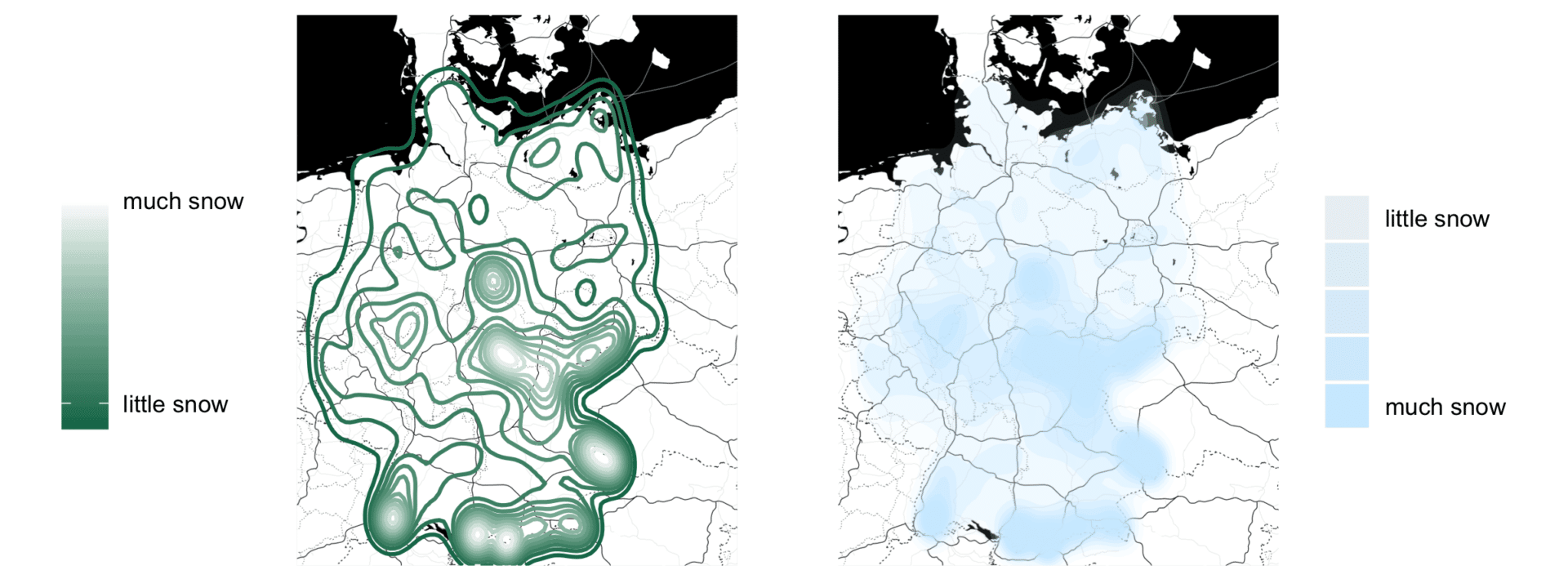
Average snow depth on Christmas Eve (2008-2017)
Our plots give a first taste of what can be done with ggmap. However, based on the historic data, there won’t be a white Christmas for the most of us… Against all odds, I still hope that outside there’s a winter wonderland waiting for you just now.
From everybody here at STATWORX happy holidays and a happy new year!
References
- D. Kahle and H. Wickham. ggmap: Spatial Visualization with ggplot2. The R Journal, 5(1), 144-161. http://journal.r-project.org/archive/2013-1/kahle-wickham.pdf
- DWD Climate Data Center (CDC): Tägliche Stationsmessungen Schneehöhe in cm für Deutschland, Version v18.3 & recent, abgerufen am 16.12.2018.
- Map tiles by Stamen Design, under CC BY 3.0. Data by OpenStreetMap, under CC BY SA respectively under ODbL.
Über den Autor
ABOUT US
STATWORX
is a consulting company for data science, statistics, machine learning and artificial intelligence located in Frankfurt, Zurich and Vienna. Sign up for our NEWSLETTER and receive reads and treats from the world of data science and AI. If you have questions or suggestions, please write us an e-mail addressed to blog(at)statworx.com.