In the last post of this series of the STATWORX Blog, we explored ggplot2's themes, which control the display of all non-data components of a plot.
Ggplot comes with several inbuilt themes that can be easily applied to any plot. However, one can tweak these out-of-the-box styles using the theme() function. We did this last time. Furthermore, one also can create a complete customized theme, that's what we're going to do in this post.
How the masters do it
When we create a theme from scratch we have to define all arguments of the theme function and set the complete argument to TRUE, signaling that the generated object indeed is a complete theme. Setting complete = TRUE also causes all elements to inherit from blank elements. This means, that every object that we want to show up in our plots has to be defined in full detail.
If we are a little lazy, instead of defining each and every argument, we also can start with an existing theme and alter only some of its arguments. Actually, this is exactly what the creators of ggplot did. While theme_gray() is "the mother of all themes" and fully defined, for example theme_bw() builds upon theme_gray() , while theme_minimal in turn builds on theme_bw() .
We can see how tedious it is to define a complete theme, if we sneak a peak at the code of theme_grey on ggplot2's GitHub repository. Further, it is obvious from the code of theme_bw or theme_minimal how much more convenient it is to create a new theme by building on an existing theme.
Creating our very own theme
What's good enough for Hadley and friends, is good enough for me. Therefore, I'm going to create my own theme based on my favourite theme, theme_minimal(). As can be seen on the GitHub repo, we can create a new theme as a function calling an existing theme, which is altered by %+replace% theme() with all alterations defined in theme().
Several arguments are passed along to the function constituting a new theme and the existing theme called within the function: Specified are the default sizes for text (base_size), lines in general (base_line_size) as well as lines pertaining to rect-objects (base_rect_size), further defined is the font family. To ensure a consitent look, all sizes aren't defined in absolute terms but relative to base sizes, using the rel() function. Therefore, for especially big or small plots the base sizes can be in- or decreased, with all other elements being adjusted automatically.
library(ggplot2)
library(gridExtra)
library(dplyr)

# generating new theme
theme_new <- function(base_size = 11,
                      base_family = "",
                      base_line_size = base_size / 170,
                      base_rect_size = base_size / 170){
  theme_minimal(base_size = base_size,
                base_family = base_family,
                base_line_size = base_line_size) %+replace%
    theme(
      plot.title = element_text(
        color = rgb(25, 43, 65, maxColorValue = 255),
        face = "bold",
        hjust = 0),
      axis.title = element_text(
        color = rgb(105, 105, 105, maxColorValue = 255),
        size = rel(0.75)),
      axis.text = element_text(
        color = rgb(105, 105, 105, maxColorValue = 255),
        size = rel(0.5)),
      panel.grid.major = element_line(
        rgb(105, 105, 105, maxColorValue = 255),
        linetype = "dotted"),
      panel.grid.minor = element_line(
        rgb(105, 105, 105, maxColorValue = 255),
        linetype = "dotted",
        size = rel(4)),

      complete = TRUE
    )
}
Other than in theme_minimal() I'm decreasing the base size to 11 and set the base line size and base rect size to base size devided by 170. I don't change the font family. The plot title is changed to a bold, dark blue font in the set base size and is left alinged. Axis text and axis ticks are set to have 75% and 50% of the base size, while their colour is changed to a light grey. Finally, the lines of the grid are defined to be dotted and light grey, with the major grid lines having the base line size and the minor grid lines having four times this size.
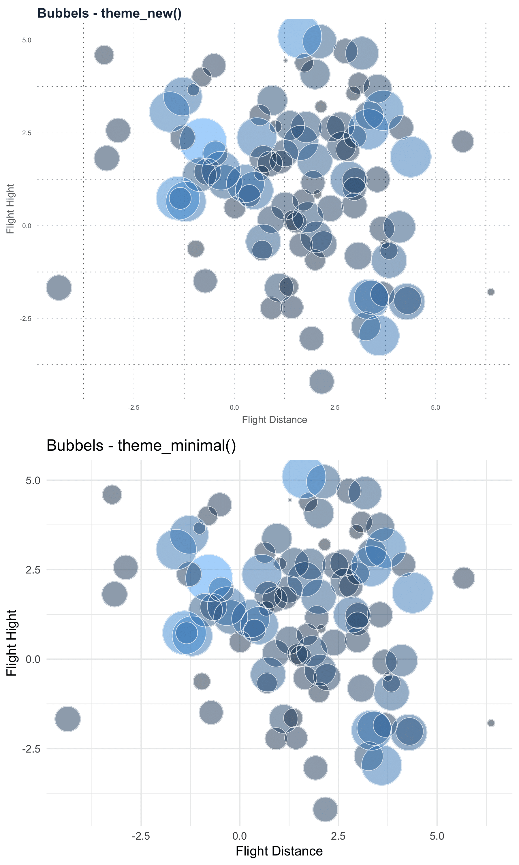
The result looks like this:
# base plot
base_plot <- data.frame(x = rnorm(n = 100, 1.5, 2),
                        y = rnorm(n = 100, 1, 2),
                        z = c(rnorm(n = 60, 0.5, 2), rnorm(n = 40, 5, 3))) %>%
  ggplot(.) +
  geom_jitter(aes(x = x, y = y, color = z, size = z),
              alpha = 0.5) +
  geom_jitter(aes(x = x, y = y, size = z),
              alpha = 0.8,
              shape = 21,
              color = "white",
              stroke = 0.4) +
  scale_size_continuous(range = c(1, 18), breaks = c(1,  4, 5, 13, 18)) +
  guides(size = FALSE, color = FALSE) +
  labs(y = "Flight Hight", x = "Flight Distance")

# plot with customized theme
p1 <- base_plot +
  ggtitle("Bubbels - theme_new()") +
  theme_new()

# plot with theme minimal
p2 <- base_plot +
    ggtitle("Bubbels - theme_minimal()") +
    theme_minimal()

grid.arrange(p1, p2, nrow = 2)
For later use, we can save our theme gerenrating script and source our customized theme function whenever we want to make use of our created theme.
So go ahead, be creative and build your signature theme!
If you want more details, our Data Visualization with R workshop may interest you!
Über den Autor
ABOUT US
STATWORX
is a consulting company for data science, statistics, machine learning and artificial intelligence located in Frankfurt, Zurich and Vienna. Sign up for our NEWSLETTER and receive reads and treats from the world of data science and AI. If you have questions or suggestions, please write us an e-mail addressed to blog(at)statworx.com.